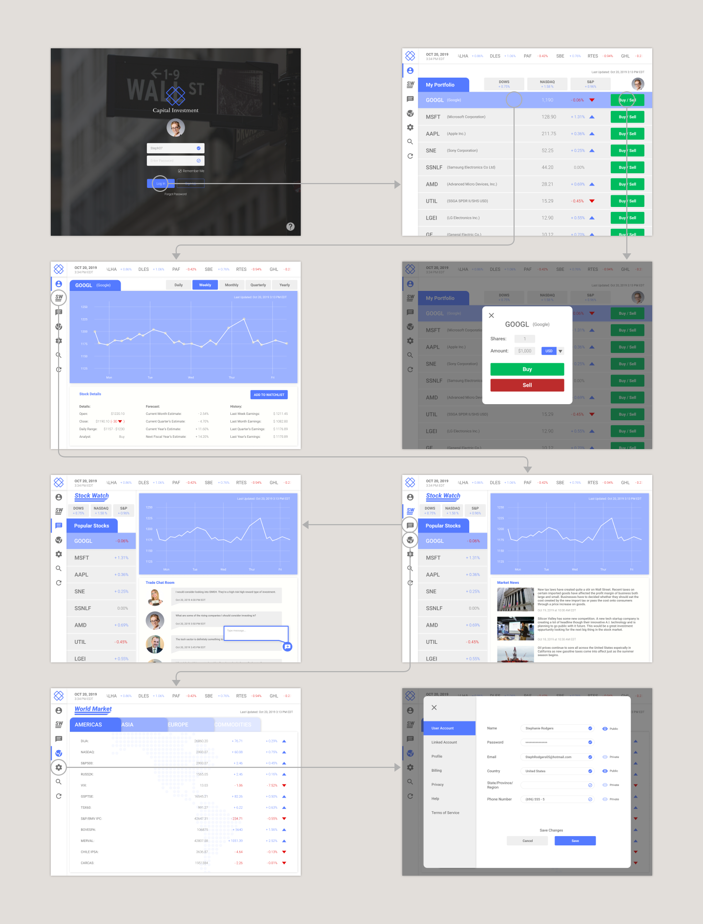
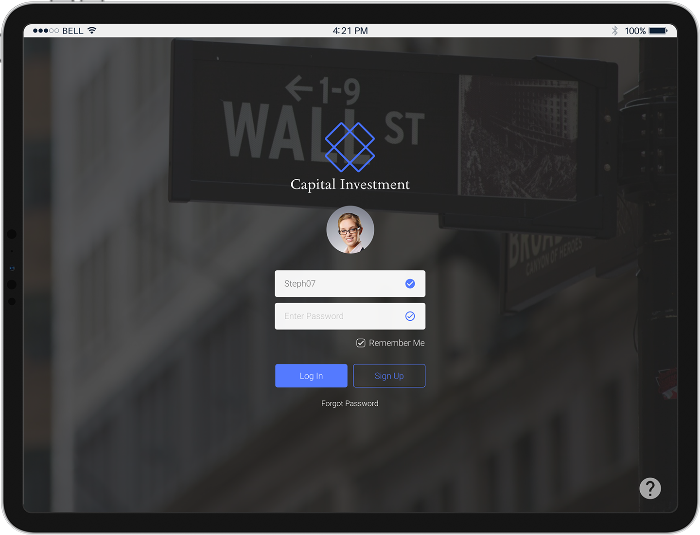
CAPITAL INVESTMENT
Tablet UI Design (Concept Project)
Role:
UI/UX DesignerTools:
Figma, PhotoshopThe Problem:
Finance and stock software are notoriously not user friendly because they feel cluttered with too much. This can confuse and makes it difficult for users to find the information they are looking for slowing down their productivity and interfering with their ability to make more money. Physical symptoms in the form of stress and anxiety can manifest too as a result of clutter and too much information because your senses struggle to understand all of it due to being overloaded.The Solution:
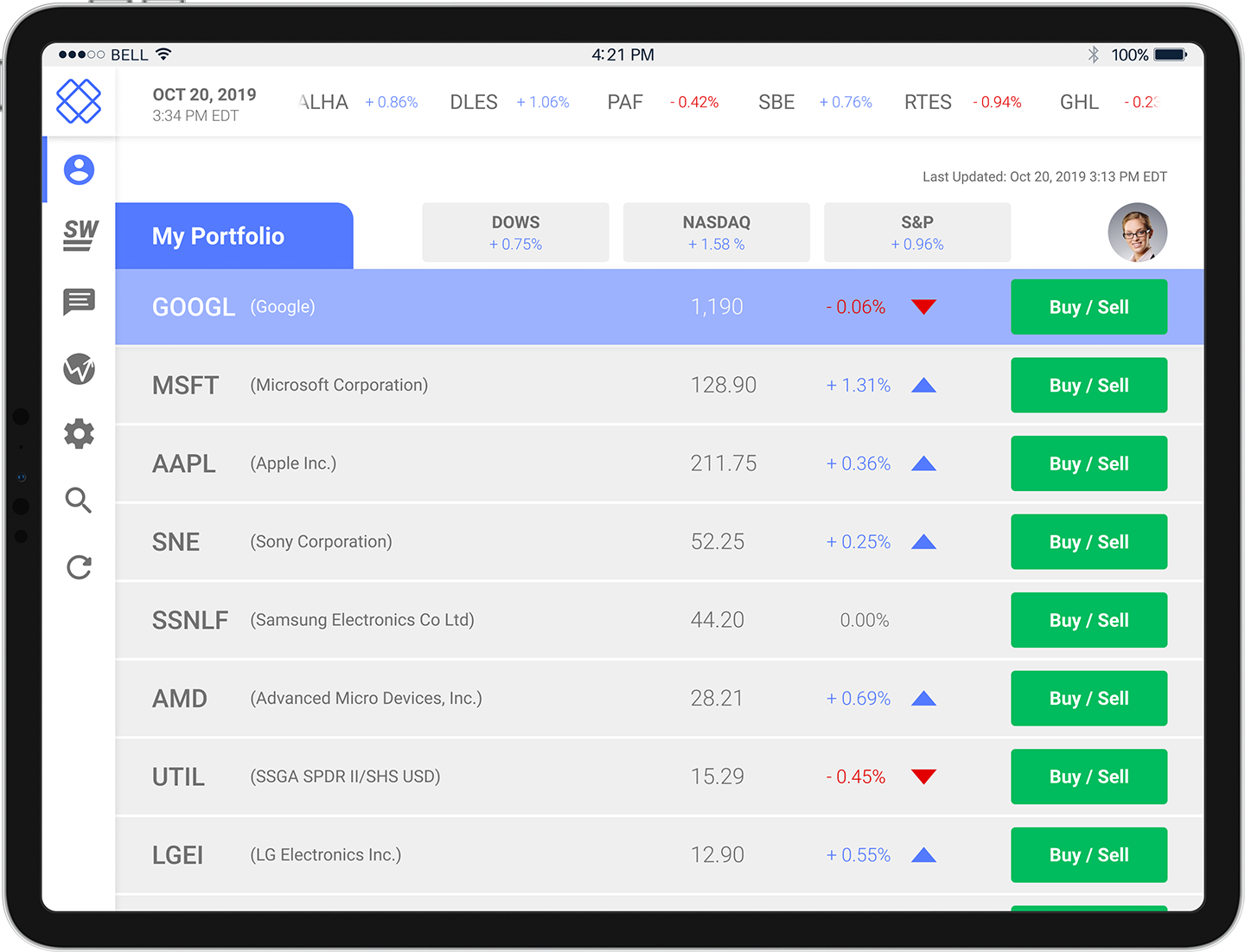
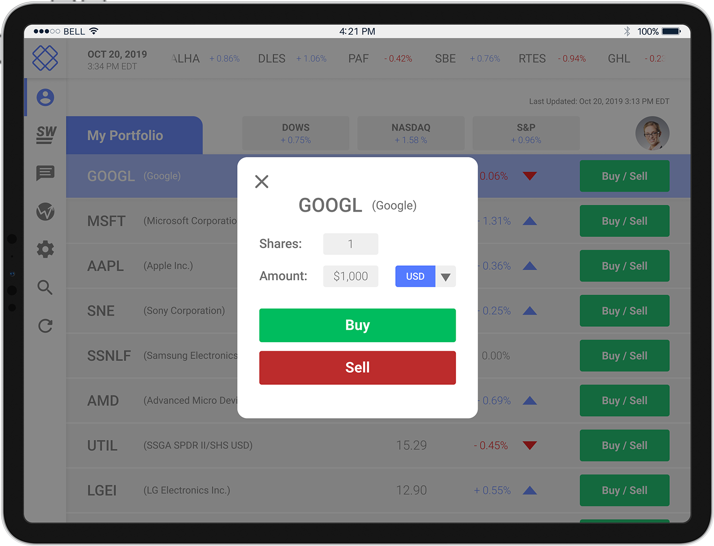
I decided to develop a stock app that improves the productivity and reduces anxiety and stress. Removing and reducing the unnecessary elements that other stock apps show and instead focusing on the elements that most users are using would declutter the app and improve productivity for the users. Incorporating more spacing between elements can allow the design to breathe reducing anxiety and stress for the users.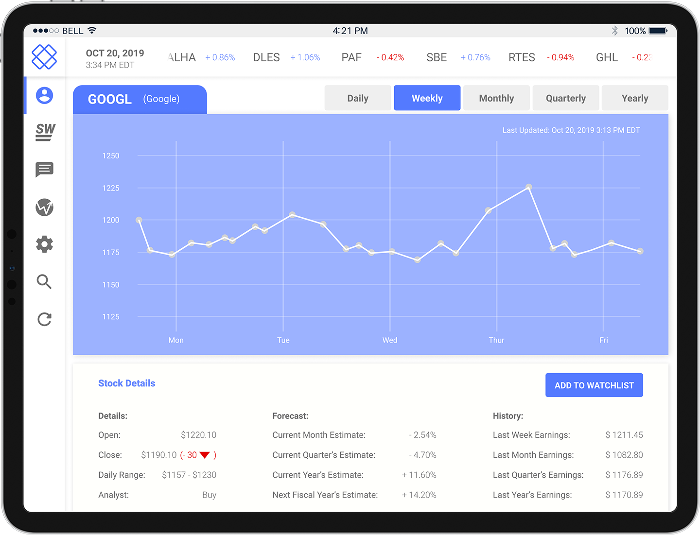
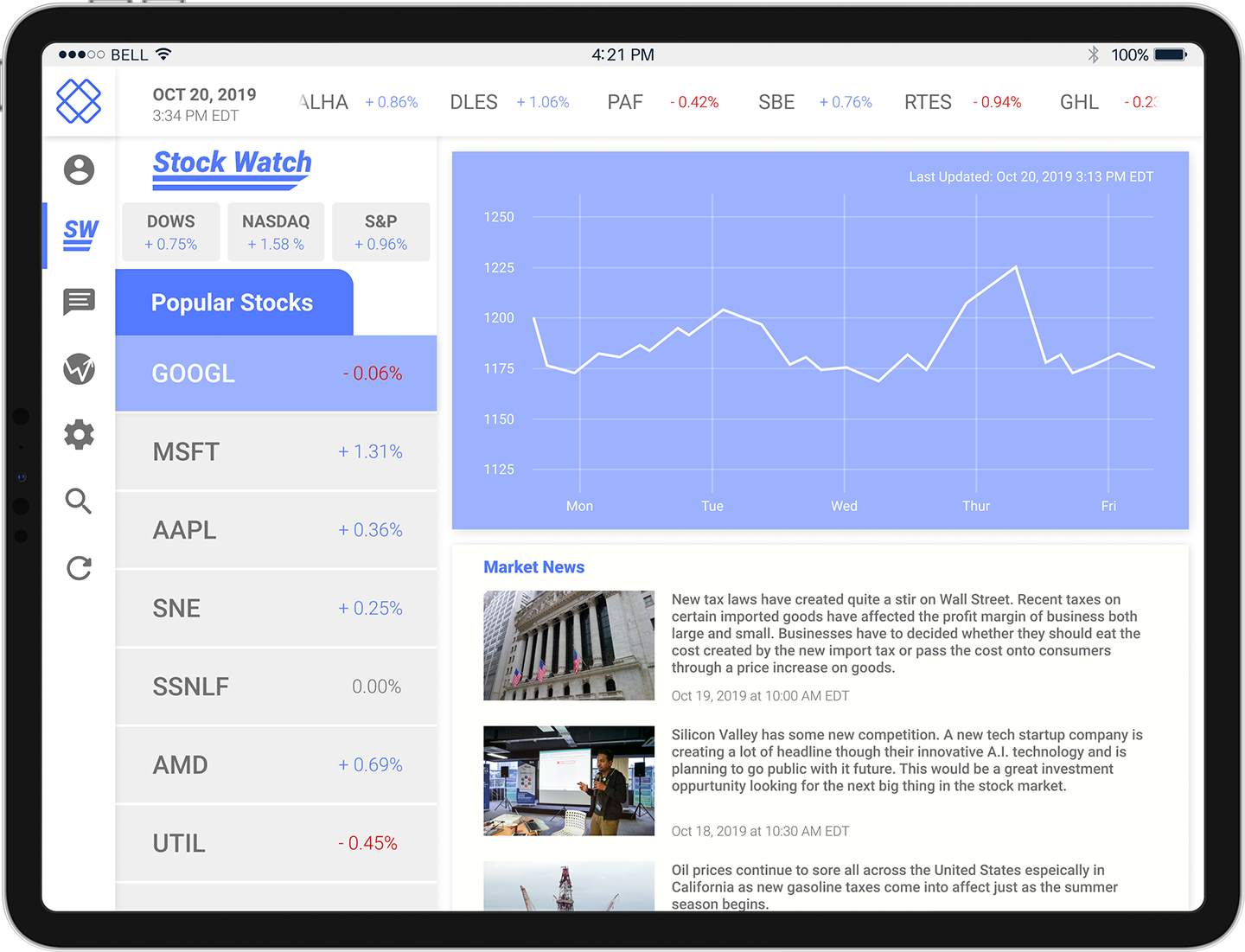
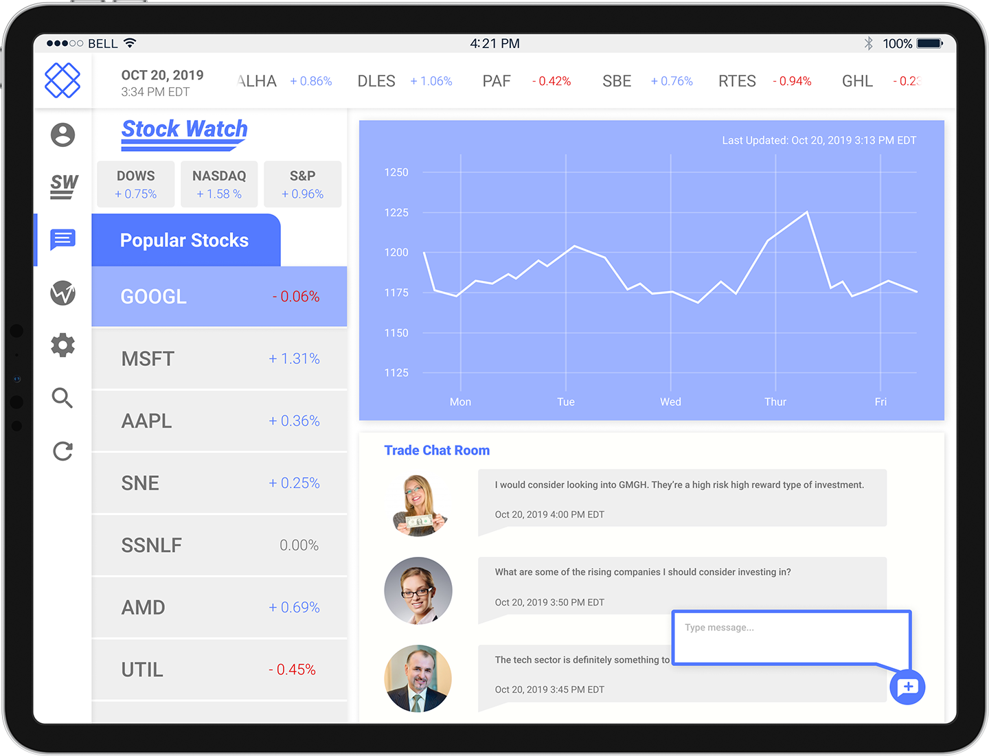
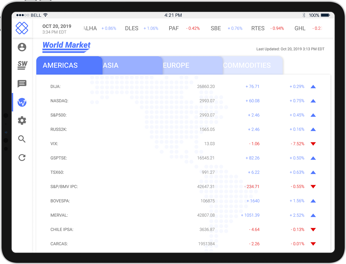
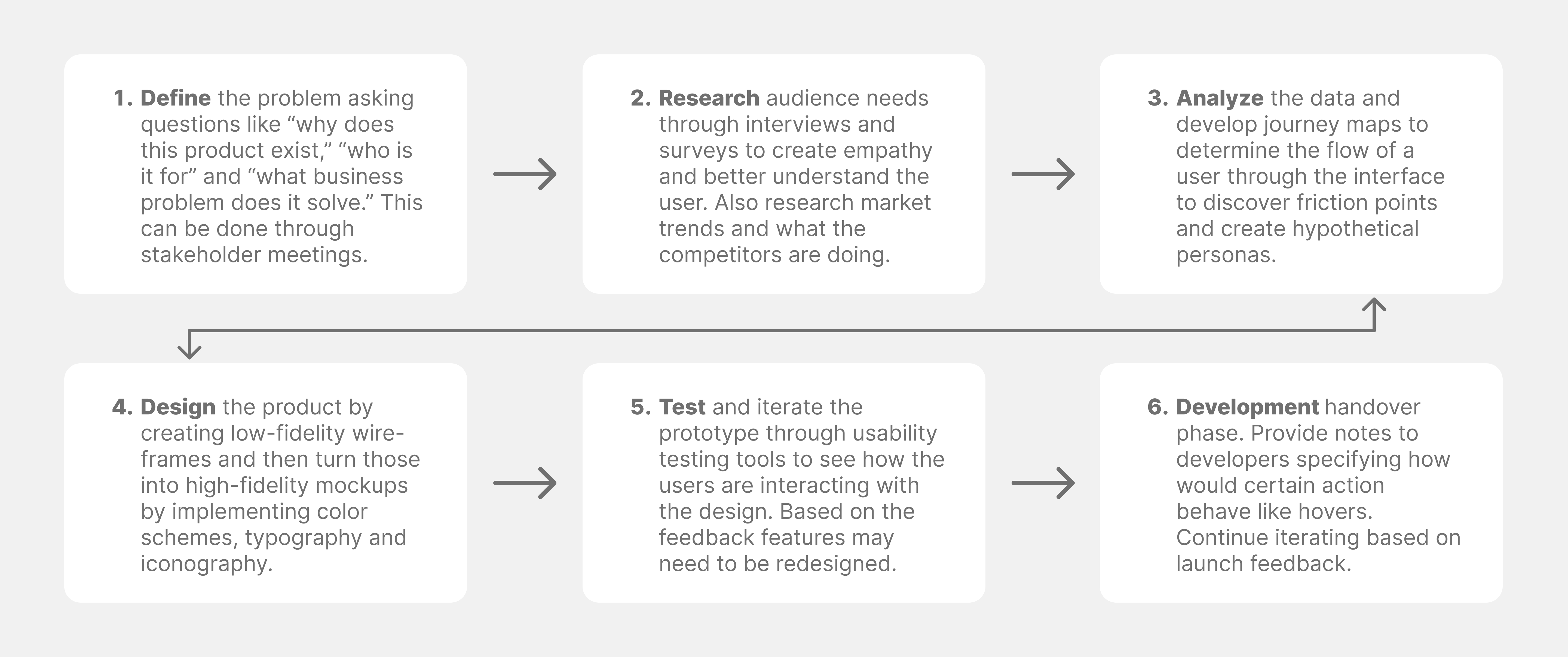
The Process:
To determine where to put important informational elements like the stock ticker a combination of data via surveys and research is collected about which area the human eyes are drawn to first on a screen. The data and research indicate that people scan screens in a Z pattern starting at the top left to the top right then down diagonally left and then right so a good place to put the stock ticker is at the top going across from left to right.The left edge of the screen is also a common area to place navigation elements because people's hands are usually touching the edges of a device when they are holding it so this is the reason why I placed all navigational icons on the left edge. Choosing to use icons rather than text for the navigational elements also provides more screen real estate so more information can be placed or seen and appears less cluttered which was the original goal.